
User experience (UX) design is the process of enhancing a website user’s satisfaction by ensuring that the usability and accessibility are spot on, and that the user will gain some form of pleasure or emotional response from using the website. Good UX on your website could be the difference between a high conversion rate and losing customers to your competition, so it’s important to get it right! To help you out, we’ve put together this list of our top tips for creating great UX.
Personalise it
Personalisation is one of the biggest trends in design at the moment, and web design is no different. Think of the success of the Coca-Cola “share a coke” campaign. Personalised coke bottles proved to be so popular, the company bring them back year after year.

Users want their experiences to be just for them. An interface that “knows” the user creates a personal experience that’s tailored to them, giving a definite wow factor. Think of some of the most used websites in the world – Amazon, Netflix, Twitter – they all offer an element of personalisation, whether it’s recommended products, suggested movies, or accounts you might like to follow.
Each of these customisations gives the UX that personal touch, helping to increase engagement and user loyalty and, most of all, letting your users enjoy using your site.
Use Interactive Content
Content that encourages users to interact really helps to drive user engagement. The more a person wants to interact with an interface, the better the experience they’ll have. Fun can make all the difference!
Try video, games, polls, quizzes, timelines and other elements that require a reaction from the user. Keep it simple though: there’s a lot of competition for peoples attention, so make sure it’s easy to use and doesn’t result in users becoming bored.
Think About Screens

Remember, users interact with your site through screens. Whether it’s a mobile, tablet, or desktop, the experience is limited to one screen at a time. This is one reason why parallax scrolling and card-style interfaces are so popular: both of these techniques create “screens” that contain certain information, and then help the user move onto the next element.
This can be tricky, thanks to the amount of information that’s normally conveyed on the screen. What works for a single screen on desktop might need to be broken down for mobile devices. It’s worthwhile spending time on though; especially when you consider how much web traffic now comes from mobiles. A more device-centric interface is much more user friendly and creates a better experience for your website traffic.
Improve loading speed
Nobody likes slow websites, right? Slow websites are much more likely to have a high bounce rate, as people simply don’t want to wait for it to load. They’ll go straight back to the Google results and try the next website down – which is probably a competitor of yours.
Ideally, a website should load in 3-4 seconds. Studies have shown that just a 2 second delay in loading time can result in an abandonment rate of up to 87%. Load speed also has an impact on your SEO; Google announced in January that as of July 2018, page speed would be a ranking factor for mobile searches
There are several things you can do to improve your website speed:
- Compress the images
- Enable caching for returning visitors
- Optimize your code
- Consider changing servers if it’s not working for you
Use convincing calls to action
A call to action (CTA) tells your website visitors what you want them to do, and good CTAs are important for achieving a high conversion rate. A website without CTAs leave the users unsure about what action to take, which not only is bad UX, but will also increase your bounce rate, losing you potential conversions.
Your CTA buttons should be bold, and stand out from the page. Use a contrasting colour; understand the psychology of colour, and understand the different emotions that colours can evoke. Decide on the message you want to convey with your button, and let that dictate the colour.
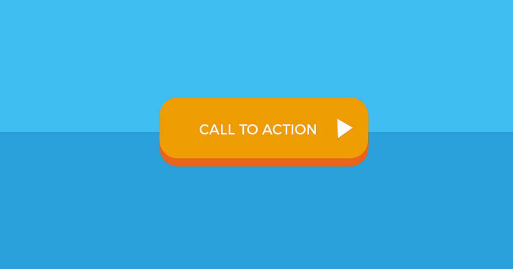
You’ll also need to choose your wording carefully. Try and give a bit more detail than just saying “next” or “continue”: you should use text that conveys to the user what will happen when they click it. Try something like “download our e-book” or “schedule an appointment”.
Incorporate a search box
People are more obsessed than ever with instant gratification. We just don’t have the patience to look through a website, clicking from page to page, to find the information we want. Typically, if a user cannot find what they’re looking for on a website straight away, they’ll just go to the next one in the search results.
Of course, your home page can’t contain absolutely all of your information, but incorporating a search box can be a great way to rectify this. Generally, search fields sit in the top right corner of a website, which is where users will naturally look for it. Allowing the users to quickly search for information greatly improves their experience with your website, and increases your chance of a conversion.
Get your readability right
Getting your readability right is an important part of both UX and content marketing. When reading a website, we rarely read the text word for word, and usually just scan the information. So if your content isn’t reader friendly, they’re unlikely to get the message you’re trying to put across.
Poor readability is also frustrating for a user – if the page is difficult to read, or looks like one big chunk of text, it can be very off-putting and can lead to them leaving the site.
Here’s how to go about improving your readability:
- Keep your sentences short
- Use a large font so that the copy is easy to read.
- Use bullet points and lists
- Don’t underline words that aren’t links!
- Keep the paragraphs short – no more than 3-4 lines.
Be mobile responsive
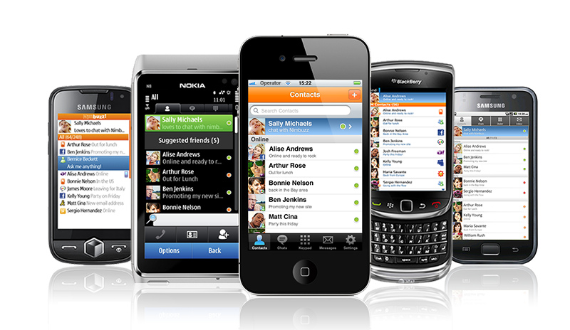
We’ve already touched on this above, but having a responsive website is vital for good UX. Over 50% of web traffic now comes from mobile devices, so you need a website that’s just as good on a smartphone as it is on a desktop. If your website isn’t responsive and a user clicks on it from their phone, it will be very difficult to use, creating a horrible experience for the user.
It’s also important for your SEO – Google’s “mobile-first” approach means that they index websites using the mobile version rather than desktop. So if your website isn’t fully responsive, not only is it poor UX, you’re likely to see a drop in your search rankings.
Use enough breathing space
You want your user’s attention to be drawn to the most important information on a page, and making use of breathing space is one of the easiest and cleanest ways of doing this.
Breathing space will not only highlight the information, but improves readability and makes your website look sleeker. Websites that make good use of breathing space feel more open, modern, and fresh.
If you’re not leaving enough breathing space, your audience may miss the most valuable content, resulting in a loss of conversions.
Keep it simple
Finally, remember to KISS (Keep It Simple, Stupid!) Simplicity and clarity in your design will be well received by your audience in just a single glance. Minimalist and simple designs are simply easier to understand, and easier to look at. Keep layouts, forms, and buttons the same across the site, and don’t be tempted to go overboard with your design! Remember, less is more.
If you’d like some more help with building a website with a great user experience, get in touch with our web design team. We’d be happy to help.