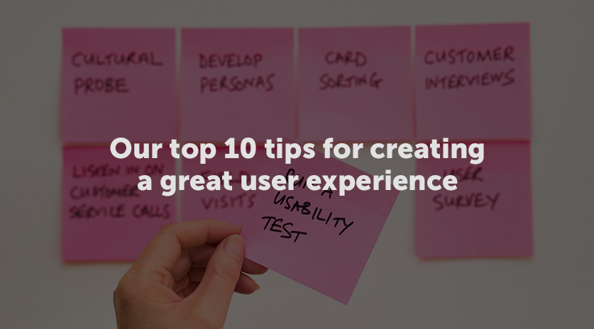
User experience (UX) design is one of the key factors you need to take into consideration when building a new website. To put it simply, UX is important because it attempts to fill your user’s needs. People have short attention spans, and when searching for information on the Internet, we just don’t have the patience to search around websites, looking for an answer. Users are much more likely to leave your website and go on to the next, looking to fulfil their need quickly.
Good UX also helps to create a positive experience for your user when they interact with your website. Good experiences resonate with users, and if they enjoy their time on your site they’re likely to revisit and become loyal to your brand. Additionally, if your UX is designed well, you can define customer journeys and guide them through to the areas of your website that are most important for business success.
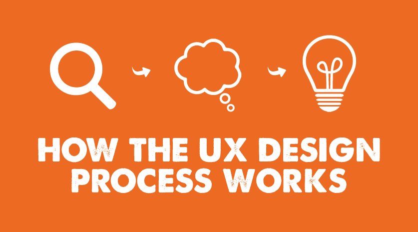
To create a successful UX design, you need to have an understanding of how users think, feel, perceive and react to your site. To do this, you need an understanding of human psychology, and to be able to apply these principles to your design. By understanding how our designs are perceived and interacted with, we can ensure that it’s working effectively to achieve both the goal of the user and the goal of our business.
Below, we’ve outlined a few of the key psychology principles that you can use to dictate your UX design.
Hick’s Law
In 1950, psychologist William Edmund Hick identified that the time it takes for a person to make a decision is dependent on the number of options they have to choose from. Sounds fairly obvious, right? But how do we apply that to UX?
To make things clearer, easier, and quicker for the user, limit the number of options that they can choose from. Imagine a restaurant where the menu has dozens of available choices for each course. We can assume that customers in those restaurants take much longer to decide on a meal than those that are choosing from a set menu – say three options for each course.

You can apply this to your UX design in a few different ways. First, look at categorizing your choices. You see this in the navigation of almost every website; if your menu offered direct access to every page within your website, you’d quickly overwhelm the user and they’d find it extremely difficult and time-consuming to find what they’re looking for.
Combat this by grouping items into high-level categories, which expand as you move through the site. The user can simply select options, following an easy journey through the site to get where they want to be.
Additionally, if you have a complex process within your site, break it down by only presenting specific parts of that process at any one time on the screen. For example, if you’re an online retailer, your checkout process might be quite long: customers need to enter their payment details, billing address, shipping address, etc. You can make this easier to digest, and less off-putting, by breaking it down into stages. For example, collect the payment information first, and then go on to a page that collects the delivery address, and so on.
By reducing the number of options available at any one time, your website becomes more user-friendly, and it’s likely to reduce your bounce rate.
The Continuity Principle
The principle of continuity states that elements arranged on a line or a curve are more likely to be perceived as related or connected. This perception can even override other strong visual groupings like colour.
This principle is important when you’re arranging elements on a page. Picture your recommended products on Amazon, or related items on Netflix. They all appear in a straight continuous line, and as users, we assume that we are looking at an organised list of items curated by an algorithm.
Truth is, although we assume this, how much of it is the truth? Do you ever look at your Netflix recommendations and wonder how on earth it’s decided that because you watched Breaking Bad, you might like to watch Love Island? I know I do. Netflix could just be offering up a series of completely unrelated titles to encourage you to watch them, but because they’re formatted in a continuous row, we automatically assume that they’re being recommended for a reason – even if it is a strange one.
On the other hand, some apps and websites like Pinterest deliberately avoid straight rows. All of the blocks on Pinterest are of different heights, and that gives more of a scrapbook or collage feeling – which is exactly what Pinterest is. They’re giving off the perception that none of the results you’re seeing are directly relevant to each other, which is perfect for the barrage of ideas that Pinterest users are looking for.
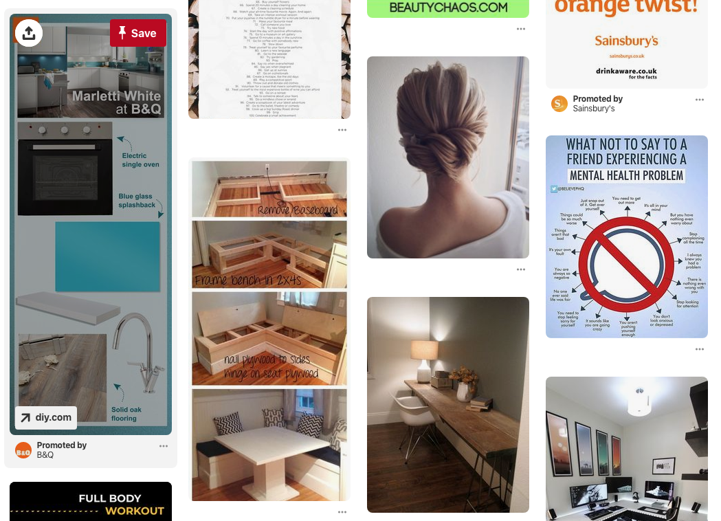
Consider how you can make use of straight and non-straight rows on your website to communicate relationships within information.
The Von Restorff Effect
Also, know as the isolation effect. This principle dictates that distinctive items are more likely to be noticed and remembered than ordinary items. To stand out from your competition, try making your designs a bit different from the norm, whether that’s visual design or UX design.
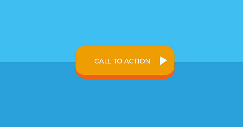
The same applies to important information on your website. This principle is the reason why all call-to-actions look different from the rest of the buttons on a website or application. It might be larger, or a different colour – either way, we want users to be able to differentiate between a simple button action and a CTA in order for them to have a clear understanding of what that button does, and to remember throughout their use of the site.
You can also draw your user’s attention to the most important part of your pages by using this principle. The classic example is of pricing options. If you offer several packages or levels of pricing, there might be one that you’d like to push your customers towards. By making it stand out from the rest, differentiating it by size, colour, or shape, you take the user’s focus to that item. The user will view that one first, and use it as their baseline when assessing your other options. On the other hand, if you want the user to observe all of your packages rather than your preference, you need to make them the same.
You can apply this principle using colour, shape, size, and spacing for objects, and for text, bold, italic, underlining, highlighting etc. Remember though, this principle should be used sparingly. Trying to emphasise too many areas of your page will require you to use too many variants, and your user will just become distracted by the noise. Maintaining balance is the key.
Occam’s Razor
Put simply, Occam’s Razor state’s that “the simplest solution is always the best.” It’s a problem-solving principle arguing that simplicity is better than complexity.
When applied to UX, it’s a warning against over-complicating design, content, or instructions. The theory encourages us to eliminate unnecessary elements that will decrease the design’s efficiency. As the principle states: “A design isn’t finished when there is nothing more to add, but when there is nothing left to take away.”

When designing your UX, analyse each element and remove as many as possible, without compromising the overall function. With the flexibility and power of the web and design tools, it’s easy to get carried away. It can result in a very complicated site with a lot of functionality, but that is difficult to use, build, and maintain.
This is a common problem when a company feels the need to put absolutely everything they possibly can on to a website, just on the small chance that someone will want the information. In a competitive market, the pressure is on to get the message out. What some companies don’t realise, though, is that users will only access about 20% of that content anyway. Being ruthless and getting rid of any content that is less valuable will make the site much more effective.
We hope that this blog has gone some way to helping illustrate how you can use psychology to dictate UX design. We’ve only covered a few of the many principles that would be useful to understand, so we recommend some wider reading if you really want to improve your UX. Or, if it all feels a bit too much, feel free to get in touch and chat with one of our UX designers. We’ll be happy to help.