“Man needs colour to live; it’s just as necessary an element as fire and water.”
– Fernand Leger
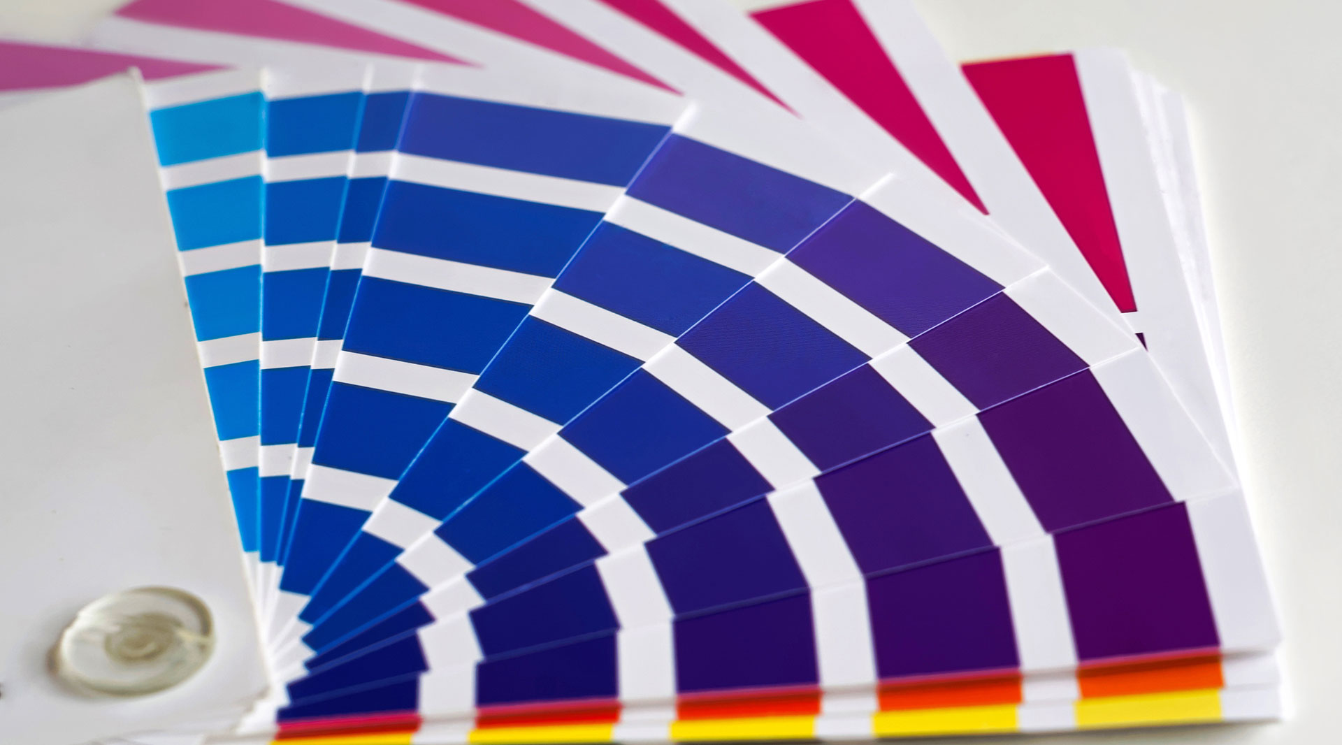
Colour has been known to have a powerful psychological impact on people’s behaviour and decisions, and this knowledge is largely transferrable to marketing and particularly branding.
The colours you choose to represent your brand are important because they will influence the message you are conveying, and can even trigger an emotional response.
There have been countless attempts to classify colours into the type of response they evoke. Below, we’ve created a list of the most commonly used colours, along with the emotive guidelines for each and recognisable brands that use each colour effectively.
Red

Arguably the most powerful of all the colours, red is not a subtle colour, and as such you should think carefully about including it in your branding. There’s a reason why sale signs and price tags are usually red – it’s been shown to speed up and intensify reactions, and reduce analytical thinking.
Red is also often used as a negative, such as marking errors in red ink, or as a warning like a road sign. However, red can also be used to create excitement, and can be symbolic of passion or romance. It also encourages appetite, which is why it’s so frequently used in fast food branding!
The positives: power, passion, fertility, romance, energy, excitement, strength
The negatives: anger, warning, danger, aggression, pain
The brands: Coca-Cola, Netflix, Virgin, Kellogs, Levis, Pinterest, ESPN
Yellow

Yellow has a relatively long wavelength, and as such it’s the most visible colour and is often used to catch attention. It also represents happiness, creativity, and optimism.
Yellow is widely considered a positive, cheerful colour, but be careful – some studies have shown that too much yellow can trigger anger, frustration, even anxiety. It’s also been shown to make babies cry!
The positives: optimism, warmth, creativity, extraversion, happiness, intellect
The negatives: fear, caution, anxiety, frustration, cowardice, irrationality
The brands: McDonalds, IMDB, DHL, Nikon, Shell, IKEA
Orange

Orange sits in between red and yellow on the colour spectrum, and causes a similar reaction in people – it combines red’s power and energy with yellow’s friendliness and fun. It’s a fun and energetic colour, and also is associated with bargains or value.
More commonly, orange is associated with Halloween, so be wary of combining orange and black, or orange and green. We also associate darker shades of orange with autumn, so this could be useful if you’re an “earthy” brand.
The positives: courage, confidence, warmth, friendliness, energy, innovation
The negatives: deprivation, frustration, frivolity, immaturity, ignorance
The brands: Amazon, EasyJet, Nickeloden, Hermes Paris, Harley Davidson, Mastercard, Xpand!
Green

Green is the easiest colour on the eye because it requires no adjustment when it hits the retina. As such, it’s calming, restful, and attractive. Green represents life, vitality, nature, and health; it’s common amongst healthy brands, from pharmacies to organic food. Green can also be linked to money and power, and so it often used in banking and even military organisations.
Like all colours though, it can have its negative side: it’s also the symbol of sickness and jealousy.
The positives: health, growth, prosperity, relaxation, nature, freshness
The negatives: envy, sickness, boredom, blandness
The brands: Starbucks, Xbox, Android, BP, Land Rover, Heineken
Blue

Blue has a very calming effect on the mind. It’s also the colour of strength, wisdom, and trust, which is why it’s so frequently used in banking and finance: Barclays, American Express, Paypal, Visa – all of them use blue as their primary brand colour.
Blue is generally a safe branding colour and is widely used – but it can also feel cold and distant, or even sad. You should also consider whether blue would help your brand to stand out from the noise.
The positives: strength, wisdom, trust, serenity, logic, security
The negatives: coolness, aloofness, unfriendliness, emotionless, sadness
The brands: Facebook, American Express, Samsung, Dell, Nivea, Twitter, PayPal, Ford
Purple
Purple historically is the colour of royalty, and as such lends itself to luxury and superiority. Purple lends itself to brands that want to position themselves as prestigious and above their competition. Purple is also associated with magic and mystery. Purple is also often associated with creativity.
Purple is one of the rarest colours in nature, and so it can come across as artificial. You should also tread carefully, as purple can cross over the line from representing luxury, into conceitedness and extravagance.
The positives: wisdom, luxury, wealth, spirituality, sophistication
The negatives: introversion, decadence, extravagance, moodiness
The brands: Cadbury, Yahoo, Zoopla, E4, Hallmark, Premier Inn, Aussie, FedEx
Pink / Magenta

Pink is without a doubt the most widely used colour to portray femininity; it can also give youth to a brand, so can be a good accompaniment for a formal brand trying to appeal to younger people. Pink is often representative of compassion, support, and kindness. Pink is also a sign of hope, and can also be very romantic.
However is overused, pink can begin to feel childish or immature. It can also convey impulsiveness, and often can be seen as an outrageous or flippant colour.
The positives: happiness, imagination, passion, kindness, unconditional love, balance, innovation, transformation
The negatives: non-conformity, flippancy, impulsiveness, childlike, immature
The brands: Victoria’s Secret, Barbie, T Mobile, Cosmopolitan, Bourjois Paris, Cancer Reasearch
White / Grey

White and grey have become the go-to colours for a clean, minimalist look. It gives a modern feel, and if executed well, looks sleek and simplistic. It can give the feeling of cleanliness, and also represents purity. White is the colour of blank slates, symbolizing freshness and new, untarnished beginnings.
However, when used poorly, white can look lazy and lack personality. It may also give the feeling of coldness, emptiness, and sterility. White as a primary colour in branding gives a limitation to your designs, so you’ll need real restraint if using white in your brand.
The positives: cleanliness, clarity, purity, sophistication, freshness, simplicity
The negatives: sterility, coldness, elitism, emptiness, unfriendliness
The brands: Apple, Adidas, Sony, Burberry, Cartier, Tesla, Prada, Mini Cooper
Black

Black is the absorption of all colours: this alone has profound psychological implications. Black is the symbol of power and luxury. It’s associated with sophistication, style and elegance, and is widely used in the fashion industry. Black also gives weight and seriousness in branding.
Too much black can give a feeling of negativity, and is synonymous with mystery, evil, depression, and even death. Use black sparingly in your branding to avoid the negative connotations.
The positives: sophistication, elegance, security, power, authority, substance
The negatives: oppression, sadness, heaviness, mourning, evil, coldness
The brands: Nike, Jack Daniels, Puma, Nespresso, Chanel, Ralph Lauren
Your brand identity defines how the world perceives your company, and colour is a huge part of that. We’ve given a general guide to the psychology of colour; however, as you’ve probably realised reading this, all colours have lots of different connotations and can be both positive and negative.
The emotions that colours trigger are far too subjective for us to be able to give a solid answer. It can depend on an individual’s personal experiences as to how they perceive a colour. While one person may see black as sleek and sophisticated, another might see it as depressing.
The psychology of colour isn’t an exact science, and much depends on how you use the colours in your brand. That said, the information given above is a good starting point, however you choose to build on it, and we can see how large brands use these colours to their advantage.
“It depends” is a frustrating end to a blog post! But in this case it’s the truth. With colour psychology, context is key. It’s the feeling, mood, and image that your branding creates that matter.
For help with branding, reach out to our brand design team; we’d love to chat.