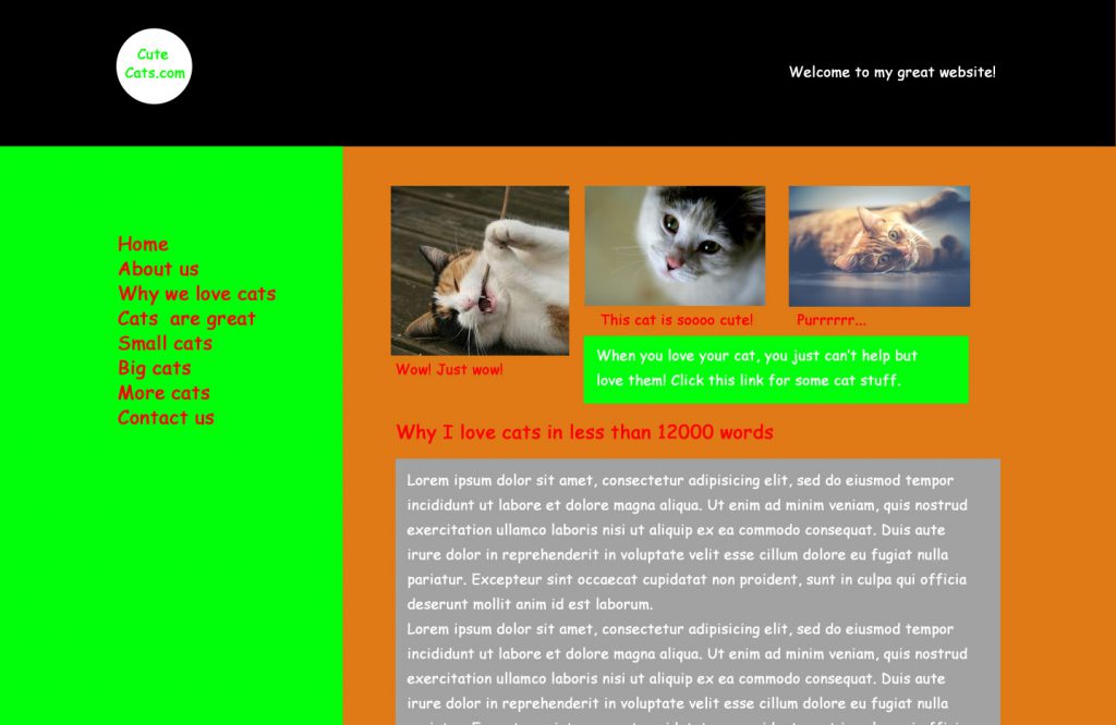
UX is a word that is much bandied around the world of Web. But what does it even mean!!!!?
The word UX literally stands for User Experience but that still doesn’t explain what it means. For us at Xpand, UX simply means good customer service (or experience) on your website.
Humour me with an analogy…
You walk into your local supermarket. Nothing is labelled. The girl stacking the shelves is chewing gum and tells you to do one when you ask for assistance. You finally find what you want but it’s on a shelf so high you can’t reach it. After climbing to the top of the shelf and retrieving said item, you look for a checkout, only to discover someone forgot to add this feature. You don’t go back.
It’s an exaggerated example but it makes the point. The harder you make it for your customers, the more annoyed they’ll get and in turn won’t never ever, like EVER come back.
And you can forget the reviews.
It’s the same with your website. If someone lands on your page and what he or she is looking for isn’t almost immediately accessible, they’ll hit the back button. That means you’ve lost a potential customer because your website didn’t provide a good enough experience for them. There’s another (user-friendly website) just a click away.

How do we provide a good service on the Web?
So how do we provide a good service on the Web? We can’t replace human interaction, the Web can’t think for itself (not yet, anyway), so until then it’s down to the Web designers and developers to ensure that your website is built in such a way that it makes finding your product simple and easy.
To quote the popular UX book by Steve Krug:
“Don’t Make Me Think”
It’s that simple. People don’t need to decipher your website. It’s not meant to be some Sudoku puzzle. Make it clear. Make it simple. Make it dummy-proof. I’m not implying that your users are dumb. They’re not. But they appreciate a common-sense approach when using your website.
We at Xpand put UX at the forefront of design. Putting fancy colours and graphics on a page means nothing if there isn’t a purpose to them. Each element needs to be thought out. On each page, we consider what the main call to action should be. We put time and thought into how a user will flow from page to page to decrease bounce rate (how quickly users leave your page). And ultimately…
“We keep it simple“
Hopefully, this article has given you a greater appreciation of the importance of UX. It’s not just a fancy buzzword, and it shouldn’t be. Even as professionals, we should be constantly reminding ourselves that a website is all about people and making the world a better place.
If you would like to discuss how we can make your customers happier, more loyal, and willing to blow your trumpet, give us a shout. We’re always ready for another perfect cup of tea and love a good chinwag. Drop us a message or give us a call to see how we can help!


