Back in August 2016 Google announced an update, which had many business owners scratching their heads in confusion.

In the past, most changes made by Google have been to improve the user experience and this one was no different. Google recognised that mobile searches had surpassed the desktop figure and started focusing on optimising the mobile experience for its users.
If your website is not mobile responsive then you are being penalised by Google and should think about making it a priority for your business website.
But that’s a topic for another day.
Today we’d like to talk to you about those annoying pop-up ads and banners (or interstitials as Google refers to them) that you may have been told to include on every inch of your website, in order to capture email addresses from your visitors. Let’s be clear: this is a very old school technique, and if you’re still doing this you need to stop.
But most importantly we’d like to discuss three alternatives you can utilise to build your email subscriber list without having to use these interstitials.
So what types of pop-ups result in Google penalising you in mobile search?
The criteria below outlines the ads that are being penalised. If your site still has these interstitials showing once a mobile search user clicks through to your website you could be in hot water. Google will punish you by hitting your business where it hurts most – visibility in its search results.
Google’s Criteria:
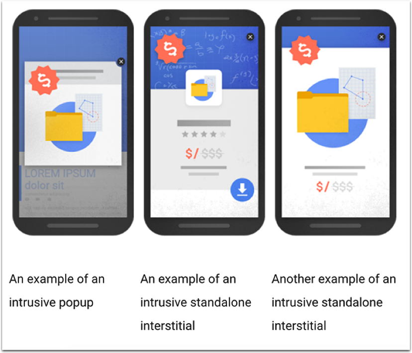
- Showing a pop-up that covers the main content, either immediately after the user navigates to a page from the search results, or while they are looking through the page.
- Displaying a standalone interstitial that the user has to dismiss before accessing the main content.
- Using a layout where the above-the-fold portion of the page appears similar to a standalone interstitial, but the original content has been inlined underneath the fold. (Via Google Webmaster Blog).

This won’t affect legal or policy pop-ups such as the ones that verify a user’s age for content suitability and cookie usage agreements. Ads that cover small areas of the screen won’t be affected.
So now I’m sure you’re wondering what this all has to do with you. Why not just get rid of these and make Google a happy bunny?
Actually, as annoying as these ads and pop-ups are, they converted visitors into subscribers very well (the quality of the subscriber, however, is still debatable). So terminating every form of email opt-in on your website may not be the best way to go, after all, you need to maintain your list building activities to keep growing your potential funnel of leads.
Email is a great way to keep in touch with your target audience and nurture them to eventually be open to your services, it goes without saying that at the very least your website must be optimised to capture the visitor’s details whenever you can. We previously discussed why email marketing is important for your business in more detail.
So what can you do? Well, here are three alternatives you can implement to your website to make sure you’re still capturing visitor data to retarget using email.
1. Create Content upgrades For Your Posts
Conventionally, when someone reads your blog post you should give them the option to subscribe to get updates at the bottom of the post, Or a few links to get them to share your article with their friends. There’s nothing wrong with that but it’s not a very effective way to approach your reader.
The better way and one that can lead to higher conversions is the contextual marketing method also known as ascension marketing (or even content upgrades- us marketers have multiple names for the same thing!).
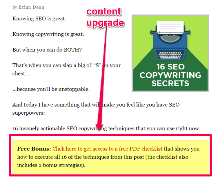
What this means is that instead of offering a generic opt-in or a generic offer, the reader gets a content upgrade on what they have just read a post about. For example, if they have been reading about SEO then you can offer a checklist to implement the strategies and tactics discussed in the post.
The whole process works like this and is more effective in getting someone to give you their email in return for the valuable information.
- You start off with writing your post as usual.
- You now create a short downloadable document (this can be a checklist or advanced methods on the topic) that helps them implement the information they have just learned from you.
- Lock this document behind a detail capture form so that it can only be accessed once they have given you their email and other details that you ask for in the form.
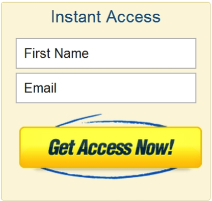
Examples of ineffective opt-in forms:


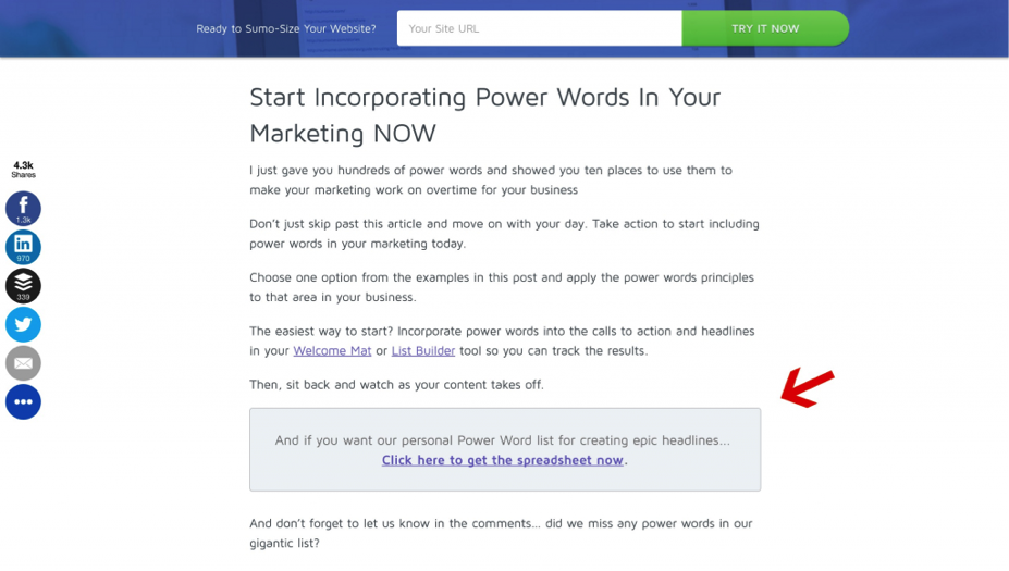
What you should change them to:


As you can see from the examples above, each post has a customised call to action to get the reader to ‘upgrade’ in exchange for their email address. They are more likely to hand it over as they have already shown an interest in your blog post (and topic).
2. Offer Something Of Value In Your Sign-Up Form And Place It In The Correct location
Gone are the days when people sign up just for a simple newsletter, people are much more wary of giving away their email details. So you need to give them something more valuable (or of perceived value). This can be a content upgrade as mentioned above or information that would be beneficial to your target audience.
Next, you need to make sure that the opt-in forms are in prominent locations, including above the fold as a ‘feature box’, at the bottom of each post or on the sidebar of your blog and website (depending on the layout). This gives you a number of opportunities to convert that particular browser into a subscriber.
3. Use Better Opt-In Forms
Simple forms like the ineffective ones I showed you above should no longer be used, they look plain and don’t give any reason for your visitor to take an action.
You can improve your opt-in forms by:
- Including testimonials near the sign-up button from past readers or users of your service/product to emphasise your value.
- Use social proof: This is one of the six pillars of influence outlined in Robert Cialdini’s book ‘The Psychology Of Persuasion’ and it shows your reader that there are others just like them that are part of your community.
- Maybe show the number of subscribers who are already benefiting from your valuable content or even the number of happy customers you already have.
- Create compelling copy that sells the prospect on why they should hand over their email to you. This needs to highlight the benefit to the reader and cover any pain points they may have that you, your email or content upgrade etc. can solve.
- Use a single ‘Call-to-action.’ Tell your reader what to do next.
Hopefully, after reading this post you are better equipped to deal with Google penalisation. Making your website comply with the rules can give you a head start in front of your competitors at ranking well in mobile search and not getting penalised for bad user experience.
If you are worried that your website may not comply, contact us to chat with one of our friendly specialists.
We’ve created the Greatest SEO Glossary Of All Time to help you understand any jargon contained in this article.


