
User Experience (UX) is the driving force behind modern web design. Through observing user behavior, making informed decisions based on analytics data, and in some cases just using good old common sense, we are able to improve and optimise the way that users interact with the web. As a result of these optimisations, many companies see notable increases in conversions.
A website is essentially like a shop. Just putting products in the shop isn’t enough to make people buy them. You have to market yourself, label your products clearly, make sure your checkout is working, and hire staff. There’s a tonne of things you have to do once you start to think it through.
It’s the same with a website. Just setting up your domain and placing some nice images on the page isn’t enough. You have to optimise the user journey (how people navigate through your site), optimise it for search engines, and increase the load speed. Again, there are lots you must do if you want your website to bring you an ROI.
With that in mind, we have compiled a list of common UX mistakes that we see all too often and possible solutions to fix them. If your website is guilty of any of the following, you may want to consider contacting a UX expert to help you get real benefit from it.
Oversized fixed headers
A fixed header is when the top part of the page (typically the navigation menu) sticks to the top of the page as the user scrolls. This type of header is fine as long as it’s not too large. Consider that on a mobile device, this header may take up as much as a third of the screen, thus making it difficult for users to view the content on your site.
Solutions:
- Keep the large fixed header on desktop but have a smaller one on mobile. This solution is probably sub-optimal as you will still have a large header taking up space on desktops and not all people use huge screens. Consider users on the small netbooks with screen sizes ranging from 7-12 inches. A large, fixed header will still take up valuable real estate.
- Redesign your header altogether. Is there anything you could live without? Do you really need those social icons? A search bar? If you can make your header slimmer without impacting the user flow then do so!
- Hide the sub-options in the menu when the user scrolls. This is a good solution for when you have a large, fixed header with some sub-options such as a search bar or log in link. The idea is that all the features are available when the user sees the top of the page but as they begin to scroll, the less important features are hidden.
Scroll Hijacking
Scroll hijacking is when the developer uses JavaScript code to take control of how the page scrolls. An example is a website with a small arrow under the main header which scrolls you to a desired part of the page. The problem with this sort of scrolling is that it can confuse or even irritate some users. You’re also taking the control away from the user, which could cause them to miss the thing they were actually looking for.
Don’t simply use this technique because it’s trendy. Put some real thought into whether or not you need to use it. There are some cases where this technique is justified, but don’t use it just because you can.
Solutions:
- If you do use scrolling effects, be sure to test edge cases. Make sure there are no bugs in your code. What if the user tries to scroll up as the page is being scrolled down? Are there any glitches? The takeaway here is that if you are going to use it, be aware of any possible situations that might cause the functionality to break or just make the user experience confusing and messy.
- Consider how you can indicate to the user what’s happening or what will happen. For example, use navigation indicators to show the user what part of the journey they’re on. If the page scrolls through three distinct sections, then make sure to indicate this with navigation. Tumblr does this on their current signup page. However, I still find it to be a little clunky and hard to control compared to traditional scrolling.
Thin Fonts or unreadable typography
Custom fonts are here to stay but don’t fall into the trap of using them just because they’re trendy. Thin typefaces can create a great visual appeal but can be hard to read for people with less than perfect vision (consider your main user base) and don’t always render well on mobile devices. As such, thin typography should be limited to micro-copy or headings.
Solutions:
- Have a different font weight for mobile devices. As we can easily target different device widths, it’s super easy to apply a thicker font for mobile users.
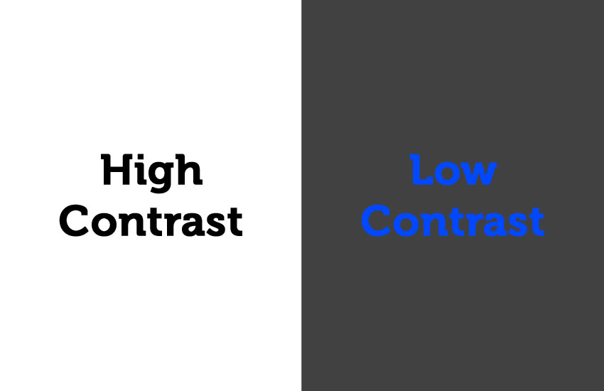
- Use thin fonts only in high contrast situations. If you must use thin fonts, make sure they’re well contrasted against their background element. An obvious example of this is white text on a black background. This isn’t a perfect solution but should ensure that it’s at least a little easier to read. Which leads onto the next point…
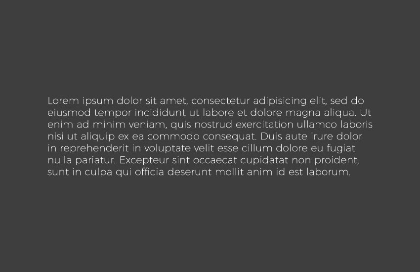
Low contrast
Low contrast is when you have elements or text that is set against a background of similar colour. Consider the following example. It’s not exactly easy to see the text in this example though aesthetically it looks good.
Solution:
- Don’t use low contrast. Period. There are some use cases, but where calls to action and important information are concerned, you should stay well away from low contrast.
Ineffective Carousels
Carousels are basically slideshows that go round in an infinite loop. The problem with these is that people use them just because they can. You should first consider if your content is best served in a carousel. If you have important information that is hidden deep down in the carousel, will people see it?
If you already have a carousel on your site it may be worth running some tests to see how people are actually interacting with the carousel. If it turns out that most people never go past the first few options, then it may be worth splitting your content out.
Another bad use of carousels is when the content in them has no actual purpose. For example: a collection of icons that don’t actually do anything. People haven’t come to your website to play with your carousel but to complete a task. Don’t risk losing valuable conversions for the sake of being trendy.
Solutions:
- Don’t put more than 5 items in a carousel. People generally don’t go much deeper than this and any content further down in the carousel is likely to be missed.
- Use navigation. One of the worst crimes I’ve seen with carousels is lack of navigation, so it’s impossible for the user to control it. You can’t expect your users to know that the large image in your hero area is a carousel. They won’t sit looking at it waiting for it to move. So make sure you have navigation and indicators to let the user know how many pages they have to scroll through.
Designing for yourself
Web design isn’t art. Contrary to what some web designers will have you believe. In other words, don’t design a website for yourself. You have to be designing with the user in mind. Of course, there are exceptions to this rule, like a personal blog site for example, but if you’re selling a product or a service, you just need something easy to use.
Solutions:
- Do user testing. By analysing user data, you can make informed decisions about what works best. Of course, this kind of data can be hard to digest. If you’re not sure how best to do this then why not drop us a message? We eat data for breakfast!
Intrusive popups
We’ve all seen those annoying popups that hijack the screen as soon as you visit a website. Most people either hit the back button or close it immediately. Why would you subscribe to something you hardly know anything about? Popups can be useful if implemented correctly. Just be sure not to irritate your users or they’ll be part of your ‘bounce rate’ instead of a conversion.
Solutions:
- Present popups at the right moment. Some pop-ups are designed to predict user activity. Some will pop up as your mouse gravitates towards the back button (though I find this a slightly desperate tactic) and others only appear after finishing an article. Whatever it is, time your popups correctly and they will have a higher impact.
- Make the content relevant. If someone is viewing one of your products and a pop-up suddenly appears asking them to sign up to the newsletter, you can’t fault them for feeling slightly miffed. Make your popups relevant to the content the user is looking at.
- Don’t ask for too much information in the pop-up. People are lazy. Sorry, they just are. No one wants to fill in six fields to sign up to your newsletter. Name and email are sufficient in most cases.
- Don’t present ugly pop-ups. Make the design attractive and people will be more likely to engage with it. Nicely designed popups say something about your brand. It shows how serious you are about quality, which, at a subconscious level may tip the balance between running away and getting on board.
Breaking patterns just because
While it’s true that a huge percentage of websites use a very similar pattern (logo top left, menu on right, hero area etc), breaking that pattern just for the sake of it may confuse your users. People become accustomed to certain conventions such as clicking the logo leads to the home page and the menu will be at the top of the page.
Solution:
- Use tried and tested patterns. While you may be tempted to create the holy grail of websites, in most cases, going with convention works best. Hence the reason no one drives around in a square-wheeled car
Squashing desktop content down to mobile
With the introduction of responsive web design, it’s just daft to have a desktop website squashed down onto mobile devices. Unless your clients enjoy viewing websites through a microscope, you should be investing in a fully responsive website. At Xpand, we build all of our websites with a mobile-first approach, ensuring that your key services and products are easy to find, no matter what device your users are viewing your site on.
Solutions:
- Get your website redesigned. While this might not always be an option, just remember, it’s an investment, not a cost. Over half of time spent online is on a mobile device. That means that more and more people are using mobile to browse the web and hence the need to be ahead of the curve. Get in touch with us today if you’d like to discuss your website redesign.
Congested Screens
Busy screens distract the eye and make it harder to find what you’re looking for. While there was a time when everyone had everything on their homepage (plus those annoying news tickers), we’ve learned since then. Clearly laid out content makes it much easier for users to get to the juicy stuff.
Used in the right way, cluttered pages can create an interesting effect. But in general, it’s a good rule of thumb to keep your website clean and free from clutter.
Solutions:
- Only put absolutely necessary content above the ‘fold’ (the part of the screen users first see). Consider your website homepage as a funnel that leads your users to your main conversion goal. How good of a job does it do of getting them there? If the answer is ‘not very good’, then you may want to consider redesigning the above fold content.
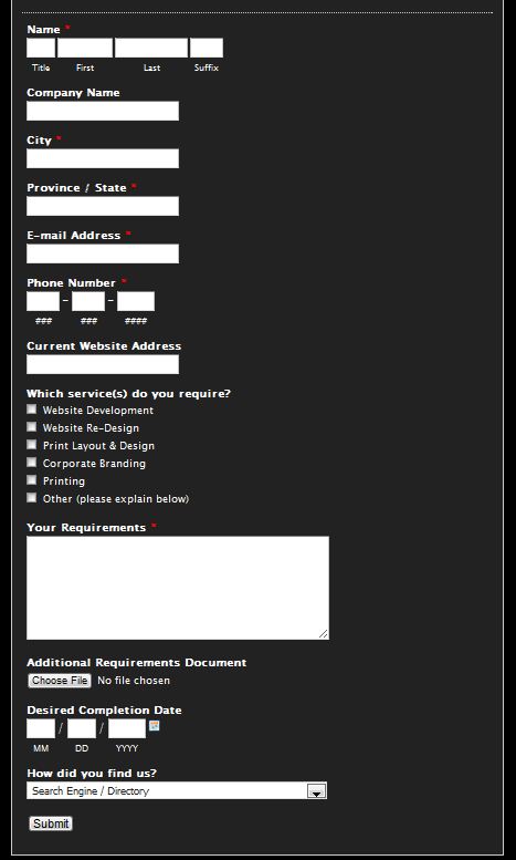
Long-winded registration screens
A registration form is a barrier to entry. If you have lots and lots of fields, users won’t bother trying to get past that barrier. Make the signup form as simple as possible.
Solutions:
- Only use the absolutely necessary fields. Users can create their profile later once they’re on board!
Conclusion
Creating good user experience isn’t a finite science. It constantly changes. That’s why it’s important to stay ahead of the curve and make sure you know everything there is to know about optimising and improving your website. A lot of the time, it’s just common sense. At other times you need to spend time looking at data and making informed decisions.
If you want to turn your website into a revenue-generating machine, then improving your UX is a good place to start. UX is the digital equivalent of good customer service. Done well, you’ll leave your customers feeling good about their decision to purchase a product or service. Done wrong, they’ll hit the back button and never return to your website again.
Why not get in touch with one of our friendly experts to discuss your UX requirements in more detail?