Your website is central to your digital marketing efforts. If you feel you could get more enquiries from your website, this webinar will provide you with valuable insight into suitable actions to take.
On Thursday 28th May, I delivered a webinar based on my experience of delivering website projects over the past 13 years.
Below is a recording of the webinar and the slides used plus a written outline of all points discussed.
A few facts
- Studies show that humans have an attention span of 8 seconds. That’s one less second than a gold fish. Ten years prior to this study, our attention spans were measured at 12 seconds. In short, we are more distracted than we’ve ever been.
- 88% of people carry out research online before buying.
- 76% of people visit a business to business website more than once before making an enquiry.
These facts point towards the importance of capturing your website user’s attention as quickly as possible and lead us to the 5 ways that you can convert your website visitors into customers.
A few important points
- The information in this webinar is focused around business to business service websites.
- There are numerous elements that make a website successful including design, images, load speed etc. These will not be discussed here.
- This webinar is focused around the assumption that you are getting reasonable website traffic.
- The actual conversion of the customer is down to you when they make contact.
The Sales Funnel
We all go through the sales funnel process, whether we’re buying a packet of gum, or whether we’re buying a house or everything in between.
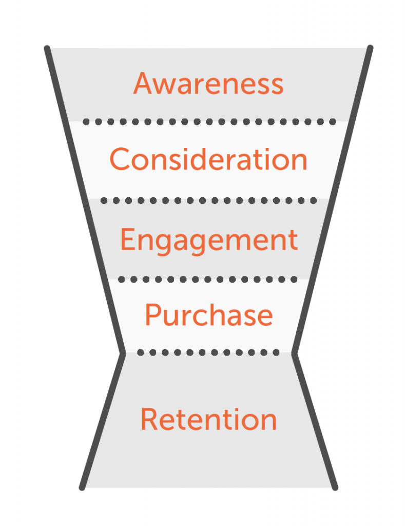
The basic stages of a sales funnel are as follows. A new car purchase will be used to demonstrate the example
1. Awareness
Your car has broken down and you need to replace it. You decide you want a BMW or an Audi because you are their target audience and they have targeted you with their advertising. You are aware of their product.
2. Consideration
You visit the BMW and Audi websites, have a look at what they have to offer and decide on each of the models you would consider buying.
3. Engagement
You visit the showrooms of both manufacturers, take both cars for a test drive.
4. Purchase
You decide you want to purchase the Audi.
5. Retention
You enjoy driving your car for 12 months and then Audi contact you to invite you to a VIP event where you can upgrade your Audi to the newest model. At this stage they are trying to retain you as a customer for as long as possible.
1) The Xpand Funnel – Creating a Lead Magnet
If you turn the sales funnel sideways, you will see in the diagram that each of the stages are factored in when someone visits your website.
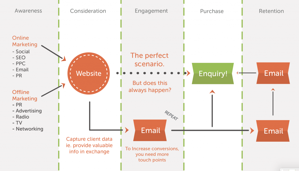
Awareness: People find your website in the awareness stage through online or offline marketing.
Consideration: They are taken to your website. In a perfect world, they go straight through to making an enquiry. Based on the research carried out, 76% of the time, this doesn’t happen.
Engagement: If you provide useful information, such as a report or useful tips, that your user is willing to give their data (email address) in exchange for, you can then set up email automation to regularly message them which gives your brand more touch points with your potential customer. This is what a lead magnet is.
We see, on average, anywhere between 3000 and 25000 marketing messages per day. You need to see a message seven times, have a need or a want for it and then you are likely to take action. This means it is crucial that you are regularly in front of your target audience through regular messaging.
Purchase: Your increased engagement with your prospect through automation will increase the chances of gaining an enquiry.
Retention: Once the enquiry has been made and you have converted the customer, you can continue to engage customers with email marketing, which will encourage them to continue to purchase from you.
Examples
Our lead magnet is our free marketing strategy template download. Feedback shows that it has been very useful to its recipients and we have been allowed to message these users with other useful information.
An accountancy practice: Content around how to grow your business without taking on more staff
A finance broker: Content around helping people manage cashflow – ‘Five ways to manage your cash flow better’
An insurance company: Content around ’Seven ways to save on your on your annual insurance premium’
A print company: A downloadable template pack for stationery design e.g. In Design template files.
Always ensure any data capture techniques are GDPR compliant.
A Few Tips
- Make sure you know how long it takes from point of contact to the point of conversion. This will dictate how regularly you need to email prospects.
- Know your website users’ buying patterns.
- Give them a reason to come back to your website – regular, well thought out blogs.
- Email automation software examples include Mailchimp, Campaign Monitor and Active Campaign
2) Building Credibility through Testimonials and Reviews
Why do you need to build credibility through testimonials and reviews? It’s a great way to create emotional appeal.
If somebody is writing a testimonial or review for you, and it’s something that your website users can relate to, it builds credibility for your brand.
When something is seen to be written by a third party, it adds a lot more clout to what is being said!
So, what makes a good testimonial?
Keep Language Natural
Sometimes a client may ask you to write a testimonial on their behalf and they will approve it because they don’t have time. This isn’t the way to go about it because it isn’t genuine.
The best time to ask is when you have just delivered a project or outcome that they are happy with. They are most likely to write one for you at that time. It’s worth building this into your sales process so it’s something that always gets done.
Ensure you keep the language natural. People can spot a fake testimonial from a mile away. It doesn’t have to be in the Queen’s English, unless of course it’s the Queen giving you a testimonial!
Authenticity is something people buy into more now than ever before. We are now using so much digital media, we have the ability to easily spot non-authentic content very easily.
Reference an Outcome
People want to see the result of what you offer. They’re not interested in the features, they care about what’s in it for them.
Add in statistics where you can. Statistics can be very powerful as it makes the outcome quantifiable and measurable.
e.g. ‘John Smiths Accountants helped us save 3 hours a week by streamlining our systems’
This isn’t always an easy thing to achieve because it’s dependent on your client providing this information but if you make sure you’re measuring what you are doing (think about stage 6 of SOLAR7 ) you should be able to pull this information through from your clients.
Keep it Short & Concise
If you recall, we spoke about humans having an attention span of 8 seconds. Keep testimonials short and concise as this takes up less time for the reader.
Longer testimonials can go onto case study pages if you really need to get them in there.
A Few Tips
- Place a testimonial on your home page.
- You can feed reviews into your website via review platforms.
- Ask your client to mention names. It makes it more personal
- Ask your client to leave a recommendation on LinkedIn. Two for the price of one!
3) Create a LinkedIn Landing Page for a Smoother User Flow
A user flow is the way a website user passes through your website from page to page.
‘Your brand is what people say about you when you’re not in the room’
Jeff Bezos, founder of Amazon
On LinkedIn, we post content and engage with other people in the business community. One of the goals of this, whether you know it or not, is to build your personal brand.
How do you connect your personal brand to your business brand?
If you are in a position where you are trying to build your brand, it is likely to be for the purpose of connecting to your business brand so potential customers will buy from you.
The Traditional LinkedIn Profile Link
When a person visits your LinkedIn profile page and then wants to learn more about your business, they are likely to visit your website via your LinkedIn contact details. If your website link takes this person to the home page of your website, they are likely to land on your home page which will give an overview of the business.
The user then has to make the decision to navigate through the website to where they want to go. At this point, there has been a disconnect with your personal brand and your business brand.
The LinkedIn Landing Page
The LinkedIn Landing page is a dedicated page to each team member. I appreciate that this is nothing new and not re-inventing the wheel. However, standard team pages are not usually geared towards passing the user into pages associated with fulfilling a bigger picture of channelling a user into different parts of a website.
If you create a dedicated page that your LinkedIn connection can visit from your profile and this page talks about how you and your skills connect with the business, and takes you to other pages associated with this, it creates a smoother user flow than if they are just visiting your home page.
Things to include on your LinkedIn landing page could be:
- A short amount of copy about your beliefs in relation to your area of expertise. This will provide more human and value-led information that provides a much easier buy-in from users.
- Links (3 maximum) to pages that provide more information on your area of expertise – typically ‘Services’ pages
- Links to case studies you have worked on
- A testimonial written specifically for you from a client
- Links to blogs you have written
Any links outlined above will take the user to a page that should then feed them further towards the call to action (CTA) that you want them to take.
This process creates a closer connect between your personal brand and your business brand. It isn’t necessarily going to convert a visitor into an enquirier immediately, but it creates a closer connection between you and your business brand.
A Few Tips
- Think about the user flow on your LinkedIn landing page. Once the user is on your LinkedIn landing page, where do you want them to go next? Do you want them to see your areas of expertise, or maybe case studies? At what point in their journey are you asking the user to take a specific call to action? Remember, the idea is that you have warmed them into your website via your personal connection on LinkedIn so your journey should reflect that.
- Talk about what you believe in relation to your expertise. People buy into authentic beliefs and values so don’t be afraid to share your beliefs in relation to your area of expertise.
- Make eye contact in your pictures. Eyes are a strong Biomotive Trigger. Research carried out by Simon Preece showed an increase in sales when images showed animals and people making eye contact with the camera rather than looking away. Imagery on packaging is different to imagery on websites but the same principle applies. We are hard wired to make eye contact.
- Add a testimonial that talks specifically about you. The more personal it is, the better.
- To go one step further you could add a ‘work with me’ CTA. You could add a contact form dedicated to you as a team member. This will encourage people to get in touch with you directly.
- The link can also be added to your email signature.
4) Create Engaging Content for your Target Audience
- 38% of people will stop engaging with a website if the content and layout are unattractive.
- Users spend an average of 5.59 seconds looking at a website’s written content.
- If given 15 minutes to consume content, two thirds of people would rather read something beautifully designed than something plain.
If you think back to the solar seven model, content is at the heart of the model. Whether it’s on your website or whether it’s your social media, what you’re saying and the way you’re saying it, and the language you’re using is very important.
Know Your Values
What are the key three things that you believe in? The most common thing I hear is ‘well, we believe in honesty, we believe in integrity, we believe in quality’. The reality is you should believe in these things anyway – go a step further than that.
Dig deep and really think about what you believe in throughout your organisation.
Know Your Audience
Who is it that you’re writing for? If you know who you’re writing for, and you know your values, you’ll be able to create something that really connects with them.
Solve Their Problem
Tell them the about the outcomes they will get from your service our product. People want to know how their problem is going to be solved. If you’re buying a car, you probably won’t care what steel the engine is made from, you just want to know if it’s got a good fuel economy and you can fit your three kids in the back!
Lead Them Through Your Website
Earlier on I talked about user flow. Make sure you’re sending your website users on a simple journey through your website without giving too many options
Consider Behaviour Flow
Speaking of user flow, you can use Google Analytics to actually understand how people are going from your homepage, what page they’re going to, and then where they’re going from there and where they’re dropping off.
So if you’ve got a website and you’ve got Google Analytics, have a look at the section in ‘behavior’ called ‘behavior flow’ and you will see what’s happening where your visitors are going.
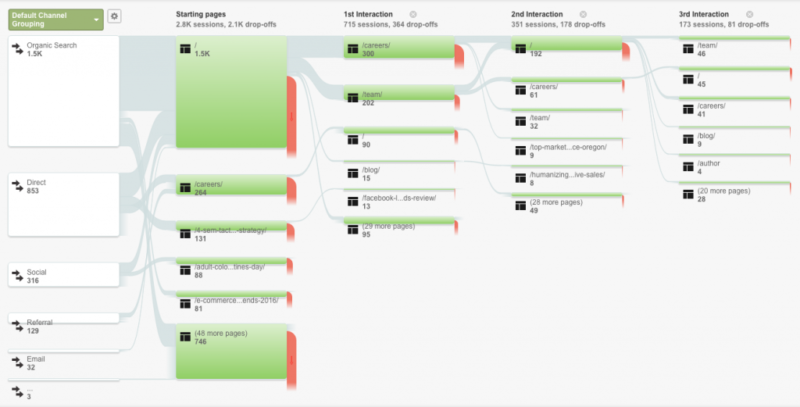
If your users are not doing what you want them to do, it means you need to make some adjustments to your website and change your calls to action, which I’ll talk about shortly.
A few Tips
Don’t write in large blocks. Different people have different reading styles – Skimmers, Swimmers & Divers.
Skimmers like to cast their eye over the main headlines and details. A block of text will simply put them off.
Swimmers like to go into a bit more detail.
Divers read the detail.
Write for your target audience, not for you.
Hire a professional copywriter that understands web usability. The ability to write words is one thing, but the ability to understand web usability is another. Make sure you check your copywriters portfolio before committing to anyone.
5) What to Consider when Placing Calls To Action on your Website
What is a call to action? A call to action is defined as:
‘A phrase that is used to tell the user exactly what action to take’
TAG Search and Select is a recruitment agency that we built a website for a few years ago.
The main hero area on the home page has two clear calls to action focussed around their audiences – clients and candidates.
It’s a very solid call to action, above what we call the fold, which is the bottom part of the page when you first go onto the website.
You need to think about what you want people to do when putting a call to action together. Do you want to entice them to provide their contact details? Do you want them to sign up for the lead magnet I’ve talked about? Or do you want them to move on to another page?
A Real World Example
We tested two calls to action on our own website – Book a Discovery Call versus Get a Quote.
We redesigned and developed our website about a year and a half ago. Step one in our SOLAR7 model is discovery.
We wanted to entice people to come to our website and book a discovery call. This would allow me to talk to prospects and bring them into our sales pipeline if we’re right for them and they’re right for us.
When we did this, we found less traffic going to this particular page. The reason was due to the terminology we had used. We made the (rather silly) assumption that everyone would understand what a ‘discovery call’ was.
We then switched the same page’s call to action to ‘Get a Quote’ and the page started seeing a lot more traffic. Just changing a few words caused users to visit that page more and make more enquiries.
To take this a step further..
We also tested our form styles and found that having a conversational style of contact form on our Get a Quote page gave a better result than a standard ‘blocky’ contact form.
The more conversational style made it more appealing to engage with.
A Few Tips
- Give all CTAs the same styling. If there is a consistency in the buttons or text used for sending people to other pages, users will be more likely to click them as they wil get used to what they need to look for.
- Use simple terminology. We overthought our approach with the ‘Book a Discovery Call Vs Get a Quote’ example I gave. Keep it simple.
- Personalise where possible. Bring in ‘your’ or ‘my’ where possible into CTAs, these are statistically proven to get better click through rates.
There’s one last thing I want to show you.
Two Extremely Powerful Tools
- Google Analytics: This is a very well known tool but if your website doesn’t have it on, I would recommend adding it straight away as it allows you to measure how people use your website.
- Lucky Orange: This tool allows you to record and watch videos of how people use your website. It’s doesn’t show what data they are typing in (it blocks this out) but allows you to see how people engage with your calls to action. It is a very powerful tool that can provide a lot of intelligence around how to improve your website user experience.
If you’d like to talk more about how you can get more enquiries from your website, get in touch.

