As a marketing agency, we frequently come across ‘crimes to design’ that will be having an impact on the brand presence of companies. Here are 5 common logo mistakes that we come across the most.
The top 5 most common logo mistakes
Mistake no. 1: A lack of flexibility.
Your brand needs to be able to work across a number of platforms, at different sizes, on different backgrounds, and on different materials.
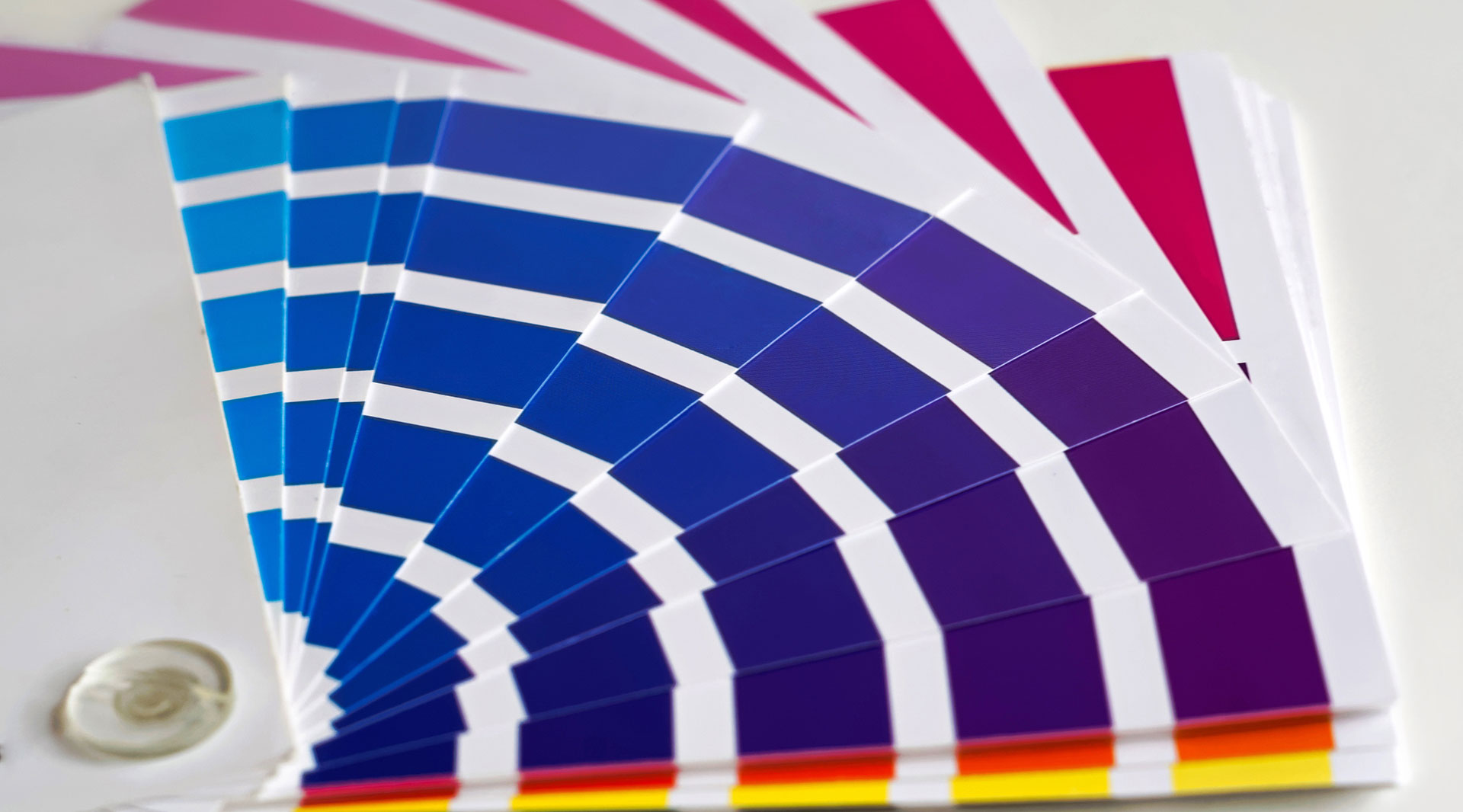
Mistake no. 2: Using the wrong colour and file formats.
Make sure you are using the right colour and file formats depending on the platform. e.g. RGB is for screen, Hex codes are for websites and Pantones and CMYK are for print. PNGs are for websites, PDFs are for print, JPEGs are for photographs
Mistake no. 3: Not using sector relevant colours and fonts
Your branding needs to speak to your target audience. This can be achieved through choice of colour and fonts.
e.g blue is the colour of trust, which is popular in the finance and legal sector.
Mistake no. 4: Not using a professional designer
If you think it’s expensive to hire a professional, wait until you hire an amateur!
Mistake no. 5: Not having brand guidelines
This helps all parties working with your brand to keep it consistent and professional!
Get in touch if you would like to discuss your branding. We’re more than happy to give a few friendly pointers.