Are you looking to create a website or update your current one, so you can generate more enquiries?
A well designed website with the right anatomy can drive targeted traffic, increase conversions and ultimately help your business grow.
Your website is your online storefront, so making sure it’s optimised to attract the right buyers, is key. It can help improve your brand image, increase visibility, provide a better user experience, and be a cost effective marketing channel, due to its 24/7 availability.
So the question is, does your website attract and retain your prospects, or are you losing traffic to your competitors?
When assessing websites for clients, we regularly come across elements that are often overlooked. It’s these elements that help decide whether the website needs a simple refresh or a full redesign.
In this webinar, marketing expert Jag, shared 5 ways to optimise your website to achieve stronger enquiries.
Jag covered:
- Knowing the journey you should take your website user through before they make that all important next step of contacting you
- Having your audience personas in place in order to make sure your website is speaking to each one of them
- Making sure your website has content that caters for different user habits
- Making use of the right kind of imagery
- Building credibility through testimonials and reviews
In the last 15+ years, we’ve worked with business owners, designing and building websites that pack a punch. Jag shared some of these useful insights and experiences in this webinar.
Webinar video:
Webinar slides:
The 5 key skill sets when creating a website
Creating a website isn’t just about putting a pretty page up on the internet. It requires a number of different skills to come together to create a website that actually has an impact, and gets you enquiries.
There’s 5 key skill sets, that are required to create your website, these are:
- The marketer
This is someone that can take a helicopter view of your brand and business. They can understand your audience and competition and know what needs to go on the website, so that you’re creating something that speaks to your target customer.
- The SEO specialist
They’ll help you get the right keywords that are relevant to your target audience, so you can use them in your content on your website. They can also help with other SEO related activities that can help your website comply with search engine requirements, such as site speed, meta titles, headlines, descriptions etc.
- The copywriter
This is one of the most underrated skills that most people don’t understand. It’s not just about writing good English or content, you need to be able to write content that converts into sales. This is what a good copywriter can do for you. They blend elements of marketing, persuasion, behaviour science, and psychology, to create content that talks to your target audience, and gets them to take a desired action.
- The user experience (UX) designer
As with above, this is not just a graphic designer but someone who can understand how to design a high converting website, in a way that is friendly to navigate for the user, but also gets them to take the right actions. They have an understanding of what’s going to go where, and why.
- The web developer
This is the person most people think of when they want to get a website created. They’re the ones who will put all the above elements together to create a high converting website. They can help create a website that has all the features it needs to nurture and convert website visitors, into leads and enquiries for your business.
Often, when dealing with much smaller, ‘one man band’ website design setups, you only get number 3 and 4 as a skill set. They may charge less for creating websites, but as you can see they miss a lot of the important skills that you need when creating a website that packs a punch.
Now you know the skill sets required, let’s get a better understanding of the things you need when it comes to your own website.
A prospect needs 7 touchpoints (minimum) with your brand, before they take action.
On average, in a day, we see anything from 3,000 to 25,000 marketing messages – we’re surrounded by branding and marketing messages everywhere we go. It’s the same for your prospects.
The big picture – 7 stages to marketing success
But, before we look at your website, we need to take a step back and see the bigger picture, and how your website fits into the wider marketing mix.
We’ve created a model that highlights the 7 stages to achieve return on investment with your marketing. This model gives you a helicopter view of all the activity that is required to achieve a positive return on investment when it comes to your marketing.
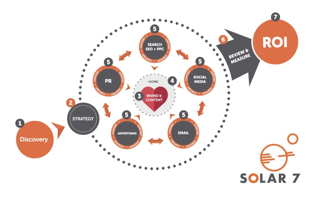
Let’s briefly explore how the 7 stages work together and help shape your website:
- Discovery – This stage is all about understanding where your business has been, where you are now, and where you want to go. It also includes target audience and competitor analysis.
- Strategy – This stage captures all activity that needs to take place to reach your objectives. It’s a step-by-step roadmap of what needs to be done and when.
- Brand and content – This is your message and your brand’s personality. It’s how you communicate with your target audience through visual elements and your written content.
- Website – This is like the sun in your marketing solar system, it’s at the centre of the model for a reason. It’s your online storefront. It’s the one place you can direct all your traffic to deliver the key messages of your brand.
- Marketing channels – These are all the various channels you can use to drive your target audience to your website. The orange ring around the channels is content, as content is the foundation of all communication channels.
- Review and measure – This stage allows you to see what’s working and what isn’t
- ROI – This is the end result of all the prior steps.
So that’s the bigger picture, but today we’ll be focussing on stage 4, the website.
A little bit of research
About a year ago Jag put up a poll on LinkedIn to ask the question “how many times do you visit a business to business website before you make an enquiry?”
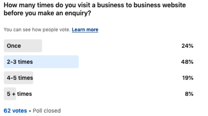
You can see from the results that 76% of people would visit a website more than once, before they pick up the phone and make an enquiry.
So to understand this journey further let’s look at the typical B2B cycle.
A typical B2B journey

- First we have the various marketing channels on the left, these direct traffic to your website. At this stage your prospects may have had numerous touch points with your brand, and they decide to visit your website.
- The reality is that while visiting your website they’ll get distracted, the phone might ring, a client might call, they might be rushing into a meeting etc.
- But, when they get the time or have another touchpoint with your brand, they might visit your website again.
- They’ll probably get distracted again.
- They might visit your website a few times, before they finally make an enquiry.
With this typical B2B journey in mind, let’s go through the rest of the points.
1. Knowing the journey you should take your website user through
What is a user journey? The user journey is the path a user may take to reach their goal when using a particular website. When you visit a website there’s usually a reason or purpose behind it, depending on that purpose, you’ll follow a certain path.
This purpose will not always be to enquire or buy. It can be to get more information, to learn more about your company, to see examples of your work etc.
With that in mind, look at the image below, what’s wrong with it?
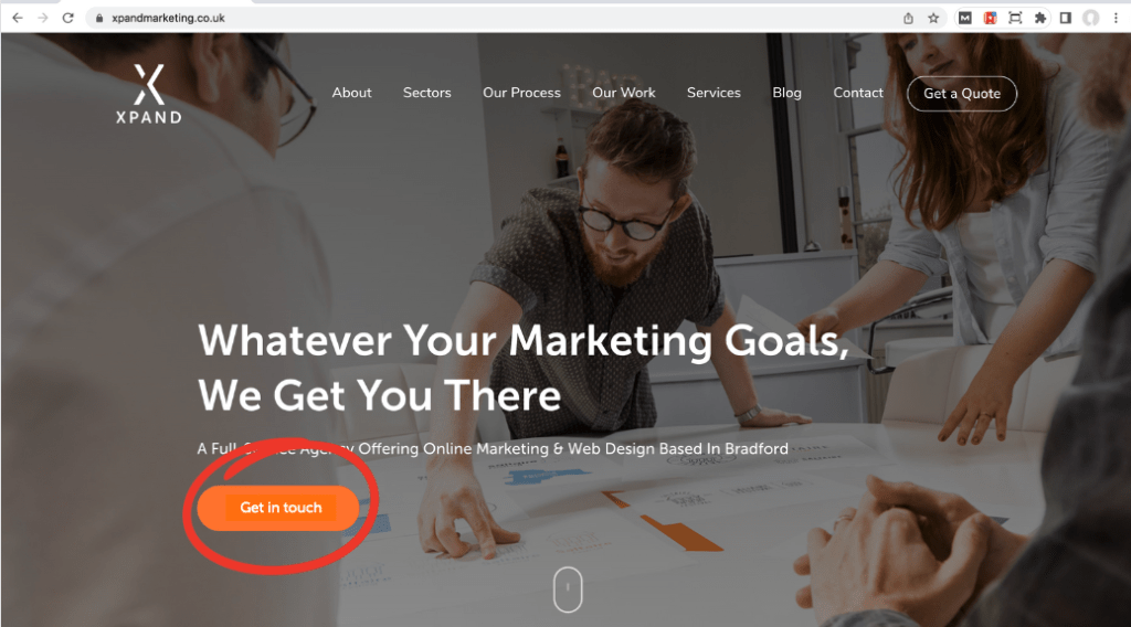
There’s a call to action button on the home page that says ‘get in touch’. Asking for a sale as soon as someone lands on your website is like going on a first date and proposing to them on the spot. You wouldn’t do that.
This doesn’t follow what a user would naturally do.
When the user first lands on your website, they most likely want to learn more about you and what you can do for them. To help them do this, your home page should look like the one below:

As we’re an agency, we have ‘view our work’ as the call to action, because that is generally the next step our users want to take. They want to see proof of what we can do for them.This falls in line with the natural journey a user would take.
Then when people click into a case study, we have other elements and calls to action that move them along the natural journey and thought process they would go through.
How to map out your user journey
You might be thinking, how can you map out your users’ journey? How do you know what actions they’ll take on your website? The answer is simple, put yourself in their shoes.
Think about what they’d like to do on your website. What information would they want to see? What do they need help with? How can you show them that they can trust your brand and business for what they’re looking for?
Once you’ve identified the above, make sure it’s digestible, no one wants to see a wall of text. Deliver the information your audience needs in digestible formats, using their language (not industry jargon), and laid out in a reader friendly format.
Also, a bonus tip is to use as many different content mediums as you can to deliver the information, this can include short form videos, testimonials, written content, infographics etc.
Below are a few typical journeys your user might take:


So where does point one – knowing your users’ journey, fit into the original B2B journey model we shared with you?

As you can see, point number one actually fits in at all touch points in your buyers journey.
2. Having your audience personas in place in order to make sure your website is speaking to each one of them
What is an audience persona? According to Hubspot, an audience persona is a semi-fictional representation of your ideal customer, based on market research and real data about your existing customers.
So where do you start? You need to start with the ‘who’. Look at the following questions and answer them in relation to your target audience:
- Who are they?
- What do they care about?
- What are their pain points?
- Why would they buy your product/service?
- When are they buying?
Now, you might have hundreds of customers all with different requirements. Ideally, you should be able to group them into 2-3 different types. Then use that information to create your audience personas. It’s ok to have 2-3 different audience personas.
You can see an example below, of one we’ve created for one of our clients, a palletised distribution company.
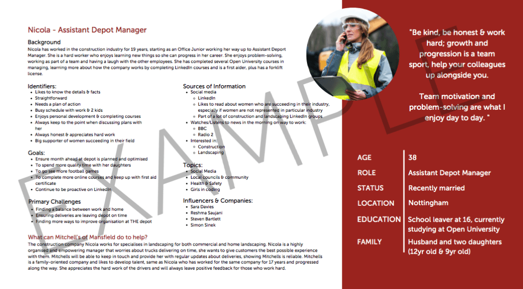
As you can see, it’s a detailed document that can inform all your marketing and sales efforts.
It allows you to get into the head of your ideal buyer.
So where does point two – having your audience personas in place, fit into the original B2B journey model we shared with you?
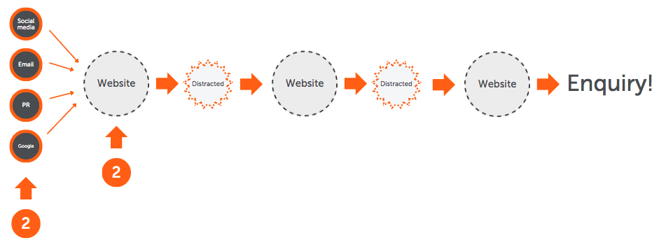
Point two fits into the start of the journey. Once you know everything about your target audience, you should be able to identify the marketing channels they use, and also you’ll know what language to use on your website to speak to their pain points.
Which takes us on to point number three.
3. Making sure your website has content that caters for different user habits
Broadly speaking, there are three types of website users:
- Skimmers
People who are skimmers will read the headings, bullet points and key stats and anything that stands out on the page. They’ll quickly make a decision on how to move forward.
These people are usually very busy and just need the main points, summarised.
- Swimmers
Swimmers may read some of the more detailed content, they might watch a video, and click onto a deeper page.
They usually like to go a little deeper and get more information.
- Divers
These people will read all the content on the page, they will watch a video, and will dive deeper into other pages on the site. They usually want to get the full picture, they want to see proof, they’ll want to see case studies, they’ll want to get their questions answered.
Which camp you fall into, depends on your own personal habits and personality profile. But it’s good to keep the above in mind when designing your website – because there’ll be people in all different camps.
Let’s look at this in relation to a sales funnel (the usual process we all go through when we buy something) as it can affect what category your audience falls into at any point.
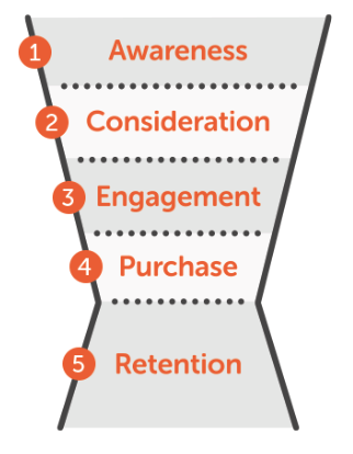
Often when your audience is first exploring a solution (and are in the awareness and consideration stages) they might behave like a skimmer, however the closer they get to making an enquiry or purchasing they may become a diver and want to know every last detail.
The image would looks something like this:
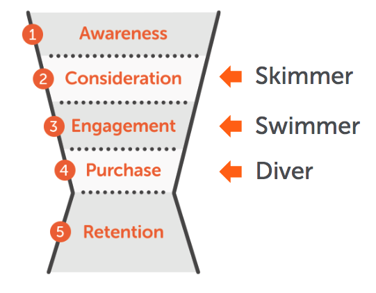
As you can see, generally, the further down you go in the sales funnel, most people will move from skimmer to diver. They want to make sure they’re making the right decision and so will look at the finer details.
So where does point three fit into the B2B buyer’s journey?
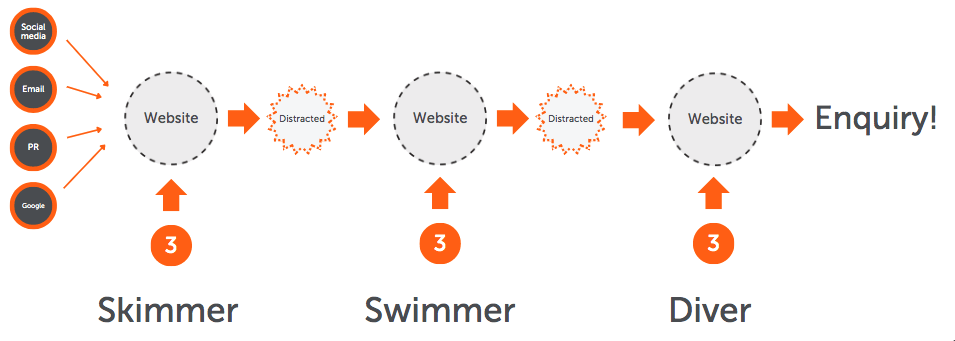
Throughout the process the skimmer will become a diver, the closer they get to the buying decision or making an enquiry. For that reason your website should cater to all three types of people.
You can do this by using a content hierarchy, like the one below:
Main headers should be in large font.
Get to the key point of the section in the first few lines, This can be made bold to create a text hierarchy.
The body copy should be in the smallest font. It’s what the user will read if they are a natural diver or further down the sales funnel.
A great example of this is a website we created for one of our clients called Zip, they’re a taxi company in Bradford. You can see how we used this hierarchy concept throughout their website.
4. Making use of the right kind of imagery
Imagery can be the make or break of your website.
We can design the most beautiful website in the world, however if the imagery isn’t right then it won’t have the same impact on your target audience, as a website with great imagery.
It takes 13 milliseconds for the human brain to process an image, and it processes images 60,000 times faster than text. That’s fast!
Great images aid in the visual impact of your website, so it’s a good idea to invest in the best imagery you can get for your website.
If you’re a service business, a great tip is to use as many people based pictures. This can be anything from pictures of your clients, to pictures of your team members. Below are some of the pictures we use on our own website and social media channels.

Example – Eyes are a strong biomotive trigger
A great example of using imagery in the right way is Andrex. With declining sales, Andrex hired a branding expert to redesign their packaging to see if they could sell more, with the use of biomotive triggers.
What exactly is a biomotive trigger? Well, according to Simon Preece, the developer of the term, biomotive triggers are sensory cues that effect our subconscious, generating emotion and action before the conscious part of our brain can respond – like our fight-or-flight response.
It’s essentially a shortcut for your brain when making decisions.
Andrex used this by changing the imagery on their packaging. They’ve always had the puppy on their packaging, but it was small and looking away. They changed this by increasing the size of the puppy and then having it make eye contact.
With the use of biomotive triggers, namely the eyes, Andrex was able to turn 6 years of volume decline into record revenue growth.
So how can you use this in a B2B environment?
Try using biomotive triggers throughout the imagery of your website, to make it more human for whoever is visiting your site. You can see a few examples of this in various places on our website:
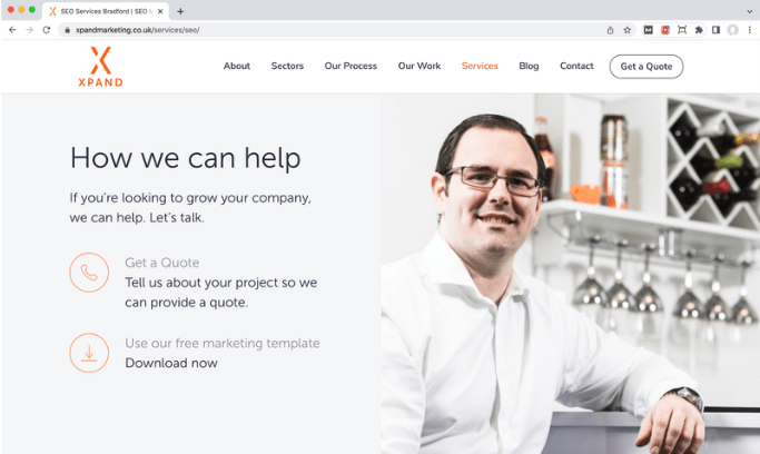
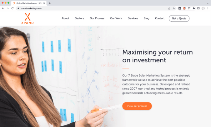
So where does point four fit into the buyer’s journey? First impressions count so this point is fundamental, right at the beginning.
Making sure your imagery is on point from the start should be top of mind. You want your website to make an impact as soon as your audience lands on it.

5. Building credibility through testimonials and reviews
Why is this important? Building credibility through testimonials allows you to showcase your happy customers and past clients. Not only that, it also helps prospects to see the ‘proof’ behind your marketing claims.
92% of customers read online reviews before buying – Big Commerce
Think about your own buying habits, very rarely do we make a big purchase nowadays without maybe consulting a friend who has the same product, or looking online for a review, or even a comparison.
In fact, for this reason there are now whole websites and YouTube channels dedicated to comparing and reviewing products and services.
72% of consumers say positive testimonials and reviews increase their trust in a business – Big Commerce
This is paramount! You want people to trust your brand, so they will be happy to become your clients. It’s a way for you to prove to them that your product/service isn’t just empty promises, but that you’ve delivered some great results for actual clients.
70% of people trust reviews and recommendations from strangers – Nielsen
These are some great stats that show the power of testimonials and reviews, so make sure you have them throughout your website, to show your audience that you can deliver a quality service.
Reviews and testimonials also tap into social proof, which is a human behaviour phenomenon whereby people copy the actions of others. If people see others using and benefiting from your service, they’ll be more likely to contact you too.
However, below are some mistakes you need to avoid:
- Have a dedicated page for testimonials – this might make sense to put all of them in one place for your user to see. However it won’t have the same impact. From our own experience we’ve found that whenever we look at analytics, this dedicated page gets the least views.
- Have testimonials rolling on a slider – it can be tempting to try and get lots of testimonials across in the form of a slider. However, again, a few years ago we had a slider on our own website with a call to action on each one. The first call to action got the vast majority of clicks, the second call to action got a significant drop, and the last two got none.
- Hidden away in deeper pages – if you only have a few testimonials make sure they’re not hidden away in deeper pages as they’ll get missed. Make them prominent throughout your website.
So what should you do with testimonials?:
- Place at least one on the home page – this allows you to build credibility and trust as soon as someone lands on your website.
- Place them throughout the website – as mentioned before, rather than having them on a dedicated page, scatter them throughout the website. This ensures that no matter what page your target audience lands on, they can see your results.
- Think about the font hierarchy – make the testimonials stand out from the rest of the content around it by making them larger.
Testimonials and reviews can help add credibility to your work so make sure to ask your clients for them as soon as you’ve delivered a good service. Sometimes all you need to do is ask. Strike when the iron is hot.
Where does point five fit into the buyer’s journey? It fits into the start of the journey, and the end.

When someone first comes across your website, it’s great to show them immediately that you’re good at what you do, and testimonials will help support your credibility.
But then as your prospect gets closer to an enquiry they’ll want to see more proof that you can actually deliver on your promises to reduce the uncertainty of them reaching out.
You now have 5 ways that you can use to optimise your website. Why not look at your current website (if you have one), and see what changes you can make right now.
If you’d like help with your website, speak to our team.

